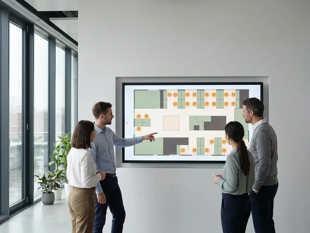
Interactive office maps improve workplace culture by making the physical office easier to navigate, more transparent, and more social. When employees can instantly see where colleagues are sitting, which desks are free, and how to get to a meeting room, the office stops feeling like a logistical obstacle and starts feeling like a place worth showing up to. The sections below unpack exactly how that shift happens and where the limits of office map software lie.
What do interactive office maps actually do?
Interactive office maps are digital, real-time visual representations of your office floor plan that employees can interact with to find available desks, locate colleagues, navigate to meeting rooms, and understand how the space is being used at any given moment. Unlike a printed floor plan, an office map responds to live data and lets people take action directly from it.
At their core, interactive office maps connect three things: the physical layout of your building, the booking system behind it, and the people moving through it. When a colleague books a desk, that booking appears on the map. When a room is occupied, the map reflects it. When someone checks in, their location becomes visible to teammates who are looking for them.
The practical functions of office map software typically include:
- Browsing available desks and booking directly from the map view
- Searching for a specific colleague and seeing where they are sitting
- Filtering by desk type, floor, or amenity (standing desk, quiet zone, near a window)
- Viewing meeting room availability and booking on the spot
- Navigating multi-floor or multi-building campuses with wayfinding
For hybrid workplaces in particular, this kind of visibility is not a nice-to-have. When employees only come in two or three days a week, they need to know the office is worth the commute before they arrive, not after.
How do interactive office maps reduce workplace friction?
Interactive office maps reduce workplace friction by eliminating the small but repeated frustrations that erode the office experience: walking the floor looking for a free desk, arriving at a booked meeting room to find it occupied, or spending ten minutes trying to find where a teammate is sitting. Each of these moments is minor in isolation, but collectively they shape how employees feel about coming in.
The most common friction points in a hybrid office are not dramatic. They are mundane. Someone books a desk but ends up in the wrong wing of the building, far from their team. A meeting room shows as available in the calendar but is already taken in practice. A new employee has no idea where anything is and spends their first weeks feeling disoriented.
Office map software addresses these problems at the source by making the current state of the office visible before anyone has to physically discover it. Employees can plan their day from home, choose a desk near their team, confirm that the meeting room they need is genuinely free, and arrive with confidence rather than uncertainty.
This matters for workplace culture because friction is cumulative. When the office consistently delivers small disappointments, people stop choosing it. When it consistently delivers clarity and ease, they start associating it with productivity and a good experience.
How do office maps help employees feel connected to colleagues?
Office maps help employees feel connected to colleagues by making presence visible and coordination effortless. In a hybrid workplace, one of the biggest cultural challenges is that employees often do not know who else is in the office on a given day, which makes spontaneous collaboration and social connection harder to sustain.
When a map shows that your closest teammates are all sitting in the same area on Tuesday, you are far more likely to book a desk nearby and show up that day. That simple visibility creates a gravitational pull toward the office on days when connection is most likely, rather than leaving it to chance or requiring a separate coordination effort over chat.
Features like Find My Colleague and Team Booking take this further by letting employees actively search for teammates and book desks in the same area. This turns the office map from a passive navigation tool into an active social coordination layer.
The cultural effect is real. When people know their colleagues will be there, they feel more motivated to come in. When they arrive and find their team nearby, the office feels like a community rather than a shared workspace they happen to occupy on the same day.
What’s the difference between a static floor plan and an interactive office map?
A static floor plan shows you where things are. An interactive office map shows you what is available, who is there, and lets you act on that information in real time. The difference is the same as the difference between a printed bus timetable and a live transit app: both show routes, but only one tells you whether the bus is actually coming.
Here is how the two compare across the dimensions that matter most for hybrid workplaces:
- Real-time data: A static floor plan reflects how the office was designed. An interactive map reflects how it is being used right now, updated as bookings are made and check-ins happen.
- Actionability: A floor plan is read-only. An interactive map lets employees book a desk, reserve a room, or navigate to a colleague directly from the interface.
- Integration: Static plans sit in isolation. Interactive office map software connects to desk booking systems, calendar tools like Microsoft 365 and Google Workspace, and occupancy sensors to keep data accurate.
- Personalization: Interactive maps let employees filter by preferences, see their own bookings, and find teammates. A floor plan treats every viewer identically.
- Analytics: Interactive maps generate data about how spaces are used over time, which feeds into capacity planning and workplace strategy. A static plan generates nothing.
For organizations running a hybrid model, a static floor plan is essentially decorative. The value of an office map comes entirely from its ability to reflect reality and respond to it.
Which workplace culture problems can office maps not solve on their own?
Interactive office maps cannot solve cultural problems that are rooted in leadership behavior, team dynamics, or organizational trust. Office map software is a coordination tool, not a culture intervention. If employees do not feel psychologically safe, do not trust their managers, or do not see a reason to collaborate, a better floor plan view will not change that.
It is worth being honest about where the limits are:
- Belonging and inclusion: An office map can show you where your team sits, but it cannot make you feel welcome when you get there. That requires intentional culture work, onboarding design, and management behavior.
- Return-to-office resistance: If employees are reluctant to come in because of commute cost, lack of flexibility, or distrust of hybrid policies, a navigation tool will not move the needle. Policy and leadership credibility matter more here.
- Meeting culture: Office maps can show you which rooms are free, but they cannot fix a culture of unnecessary meetings, poor facilitation, or over-scheduling. That requires process change.
- Team cohesion: Visibility helps, but genuine team connection is built through shared goals, regular rituals, and meaningful work, not proximity alone.
The most effective organizations use interactive office maps as one layer of a broader hybrid workplace strategy. The map reduces friction and increases visibility. The culture work, the management approach, and the workplace design fill in the rest. When those layers work together, the office becomes a place employees genuinely want to use, not just one they can navigate more efficiently.
How GoBright helps improve workplace culture through smarter office navigation
We built our Smart Office platform specifically for organizations navigating the complexity of hybrid work. Interactive office maps are at the heart of what we offer, and they work as part of a fully integrated system rather than a standalone tool.
Here is what that means in practice:
- Real-time interactive maps that let employees browse available desks, locate colleagues, and book spaces directly from a single interface
- Find My Colleague and Team Booking features that make social coordination effortless and give employees a reason to align their office days
- Full integration with Microsoft 365 and Google Workspace, so bookings made via the map sync automatically with calendars and Teams
- Workplace analytics that show facility managers how spaces are actually being used, enabling smarter decisions about layout, capacity, and investment
- ISO 27001 certification and GDPR compliance, with European data hosting, so employee location data stays secure and private
- Licensing per desk rather than per user, making the platform cost-efficient as your organization scales
If you want to see how interactive office maps can work in your specific environment, get in touch with us and we will walk you through it.
Frequently Asked Questions
How long does it typically take to implement interactive office map software?
Implementation timelines vary depending on the size and complexity of your office environment, but most organizations can go live within a few weeks. The core steps involve uploading or creating your floor plan, integrating the software with your existing tools (such as Microsoft 365 or Google Workspace), and configuring desk and room inventories. Platforms like GoBright are designed to minimize IT burden, so the setup process is generally straightforward even for multi-floor or multi-building campuses.
What if employees don't adopt the office map tool consistently — how do you drive usage?
Low adoption is usually a sign that the tool adds friction rather than removing it, so the first fix is making sure the map is genuinely easy to access — ideally from the same apps employees already use, like Microsoft Teams or a mobile browser. Beyond that, adoption tends to follow value: when employees discover they can find a desk near their team in seconds or see who else is in before commuting, usage becomes self-reinforcing. A short internal launch campaign, manager endorsement, and early wins shared across teams can accelerate that initial habit formation significantly.
How does employee location data stay private when using office map software?
Reputable office map platforms handle location data with strict privacy controls, typically showing only desk-level check-in information rather than real-time tracking throughout the building. Employees generally control their own visibility, and data is only displayed to colleagues during active booking or check-in periods. When evaluating any platform, look for GDPR compliance, ISO 27001 certification, and clarity about where employee data is hosted and for how long it is retained.
Can interactive office maps work for organizations with multiple offices or international campuses?
Yes — multi-site support is one of the areas where interactive office maps deliver the most value. Employees working across different offices or visiting a location they rarely use can navigate an unfamiliar building with the same confidence they have in their home office. Centralized analytics across all sites also give workplace and facilities teams a unified view of space utilization, making it easier to benchmark performance and make consistent decisions about layout and capacity across the portfolio.
What's the best way to measure whether our office map software is actually improving workplace culture?
Start by tracking a combination of usage metrics and experience indicators: desk booking rates, peak occupancy patterns, and the frequency of colleague search and team booking features give you behavioral data on whether employees are engaging with the tool. Pair that with qualitative signals — pulse survey scores around office experience, new employee onboarding feedback, and whether teams are self-organizing their in-office days more effectively. Culture impact is rarely visible in a single metric, but a consistent improvement across friction-related indicators is a strong signal the tool is working.
Do we need occupancy sensors for the office map to be accurate, or can it work on bookings alone?
Office maps can function effectively on booking data alone, and for many organizations that is a practical and sufficient starting point. The limitation is that bookings do not always reflect actual occupancy — people book desks and do not show up, or use spaces without booking them. Occupancy sensors close that gap by reflecting real-time physical presence rather than intent, which makes the map more accurate and the analytics more reliable. A phased approach — starting with booking-based maps and adding sensors in high-demand zones over time — is a common and cost-effective path.
How should we handle the transition from a static floor plan to an interactive office map without disrupting employees?
The smoothest transitions treat the interactive map as an upgrade to something familiar rather than a replacement of something established. Start by ensuring the digital floor plan accurately mirrors the physical space employees already know, then layer in features incrementally — desk booking first, colleague search next, analytics later. Communicating the "why" clearly (less time hunting for desks, easier team coordination) helps employees see the tool as a benefit rather than a new obligation, and a short pilot with an enthusiastic team before a full rollout can generate internal advocates who make adoption easier across the organization.