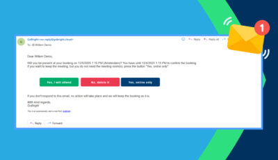
At GoBright we strive to deliver accessible solutions and products for everyone. The GoBright website and Portal, for example, should also be accessible for people with an impairment such as, vision deficiency, hearing impairments or dyslexia. We have upgraded our software so that it can be used better by people with colour vision deficiencies.
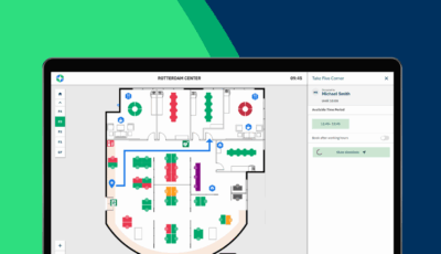
People with colour vision deficiency find it difficult to identify certain colours. Most people with colour vision deficiency have trouble distinguishing between shades of red, yellow, and green. Our platform uses the colours red (occupied), green (available), yellow (soon to be occupied), purple (needs cleaning), and blue (do not disturb). This makes it difficult for some people to see which desk or room is available, or not.
We have now added icons to the desks and rooms, which indicate the occupancy status. The icons have the following meaning:
- Tick mark: available (green).
- Cross: occupied (red).
- Pause: soon to be occupied (yellow).
- Cross: do not disturb (blue).
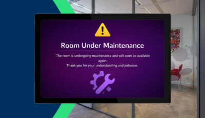
- Star: needs cleaning (purple).
- Stop sign: not bookable (grey).
![]()
It is important we create products that can be used by everyone. With upgrades and implementations such as these, we make our solutions and products more universal and flexible.